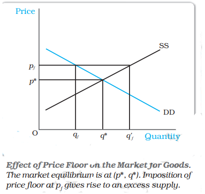
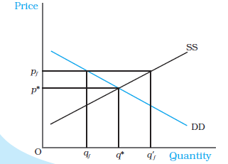
The diagram above at price p* shows the situation of?
Answer & explanation
Correct answer: option 3
The correct answer is Option 3: Equilibrium
It can be clearly seen that at price p*, there is equilibrium in the market with market demand and supply curve intersecting each other. But at price pf, supply is greater than demand, indicating a situation of excess supply.